HISTORY OF THE DISNEYLAND MARQUEE
The Original Roadside Billboards
|
1955 - 1958
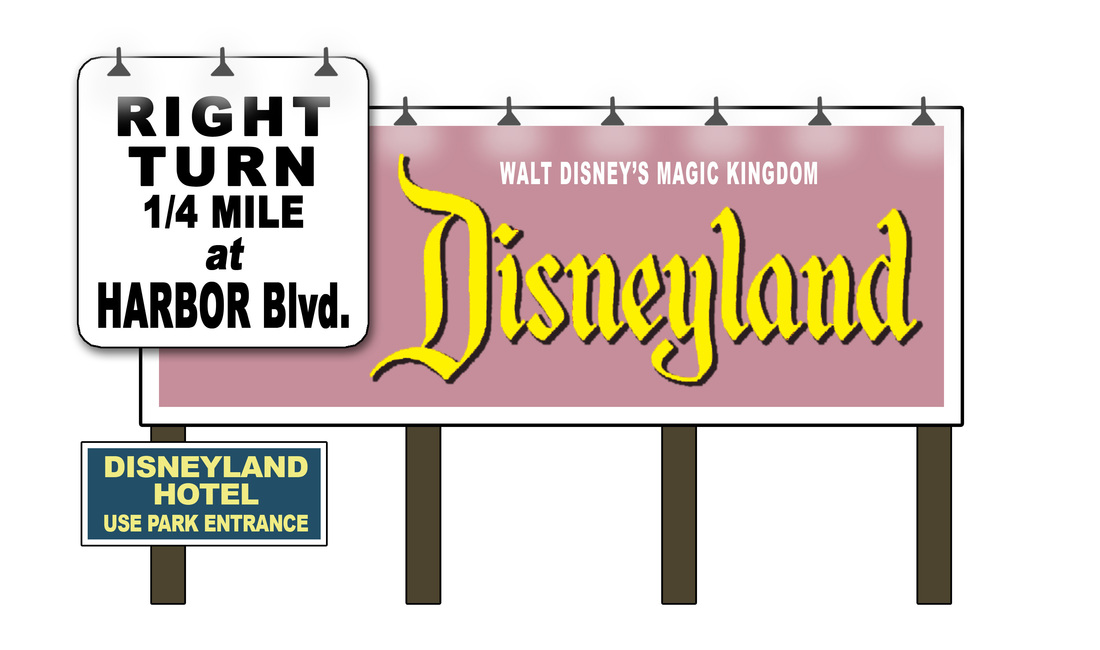
Before there was ever an iconic Disneyland sign, there were roadside billboards announcing your upcoming arrival to Disneyland park.
These signs are recreations of signs photographed back in the day, reproduced as closely as possible to help display the original, historic signage. |
Walt's Classic Marquee

|
1958 - 1979
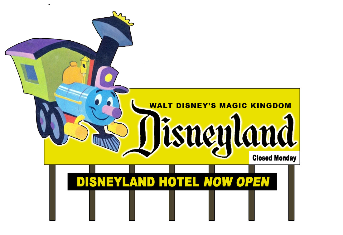
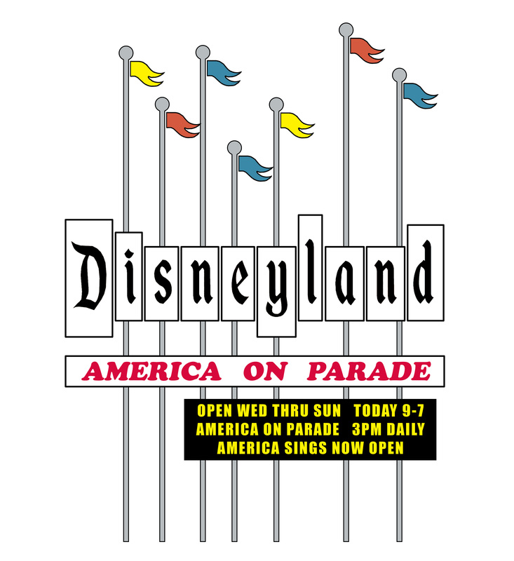
The most classic of all Disneyland signage was this version with the word "Disneyland" in the classic font, and the capital "D" in yellow, along with the tag line for the Park & Hotel Entrance. The original marquee portion was white with black letters manually updated as needed.
In later years, the marquee was upgraded, and then contained yellow letters on a black background. Finally, when the sign needed significant maintenance, the yellow "D" and the entire typeface were all replaced with newer white lettering and the tagline area began to be changed to announce the current promotion. |
|
1979 - 1989
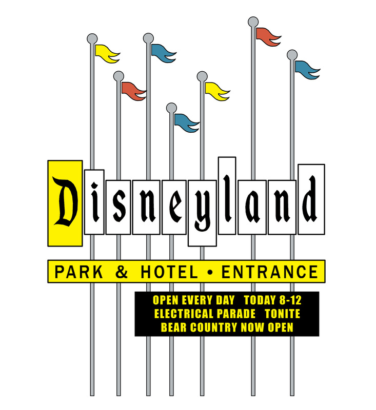
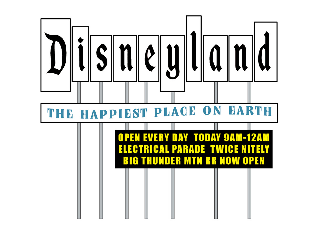
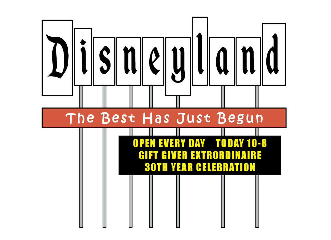
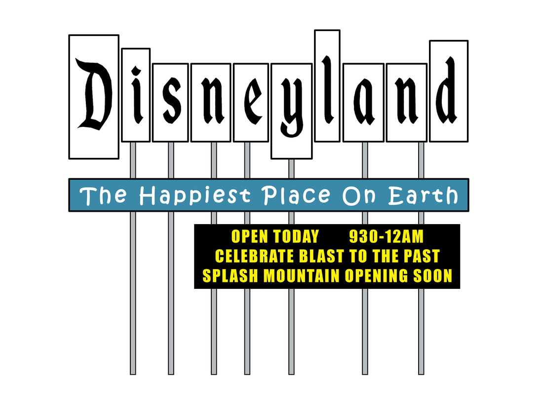
The sign lost its glorious flags, and in doing so, lost a lot of the whimsey that was evoked by the sign.
The tag line was altered to the enduring "The happiest Place on Earth", and other promotional phrases as needed. |
The Eisner Era Marquee

|
1989 - 1999
The 90's Disneyland sign tried to capture the same whimsey as the previous sign, but while it evokes a smile, it never quite lives up to the same amusement as the original predecessor. This one did have an electronic marquee, so it never really changed much during its reign on Harbor Blvd.
|
The Disneyland "Resort" Sign
2000 - The New "DISNEYLAND RESORT"
Sadly, the Disney Corporate font supersedes the classic Disneyland font
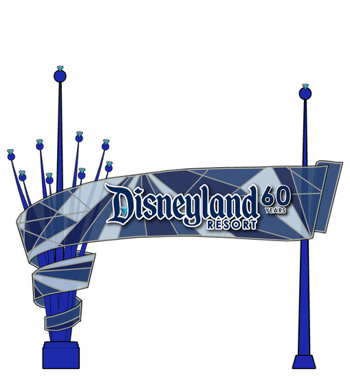
2015 - DISNEYLAND DIAMOND CELEBRATION
|
2000 - today
With multple parking lots, the Disneyland "Resort" of today does not have the singular welcome sign of days gone by. This pedestrian sign, located on Harbor Blvd., near where the previous signs once stood, is the closest thing to the previous signs.
This sign has seen a change in typeface, from the generic "Resort" font from 2001, to it resuming the classic Disneyland Park font that now defines the entire resort. This smaller sign also is easy to alter, so it is constantly changed in order to reflect whatever annual marketing message they are trying to promote. |
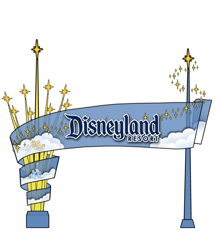
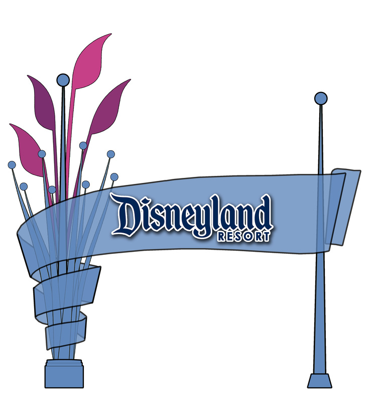
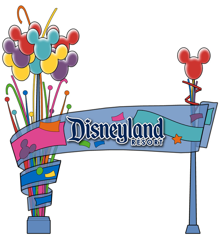
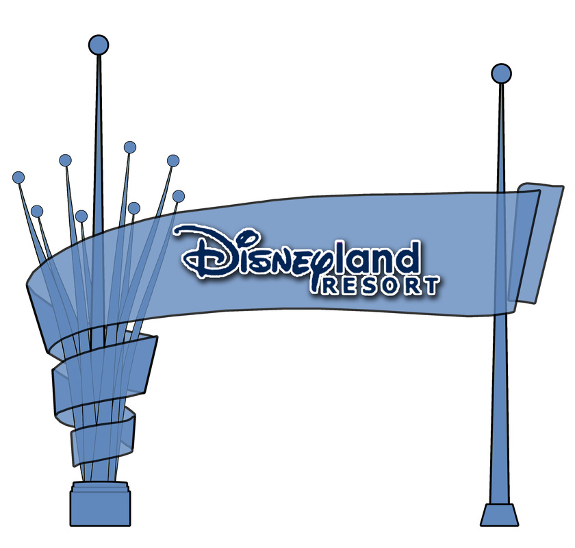
If I Designed the Marquee...
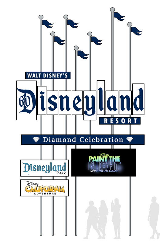
My Fantasy of what the Resort Sign should look like.
|
Modern NostalgiaDisneyland's original lands were built with varying levels of nostalgia at their core. Main Street USA, Adventureland and Frontierland each have a heritage to the past that is easy to identify. Fantasyland attractions feature 7 animated movies that are approx. 55-80 years "classic" today. Even Tomorrowland is best remembered from the 50's era nuclear grey subs, the 60's era space age white design, and even the less appreciated, steampunk-ish look of the 90's.
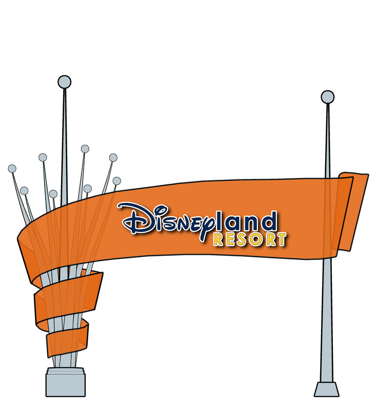
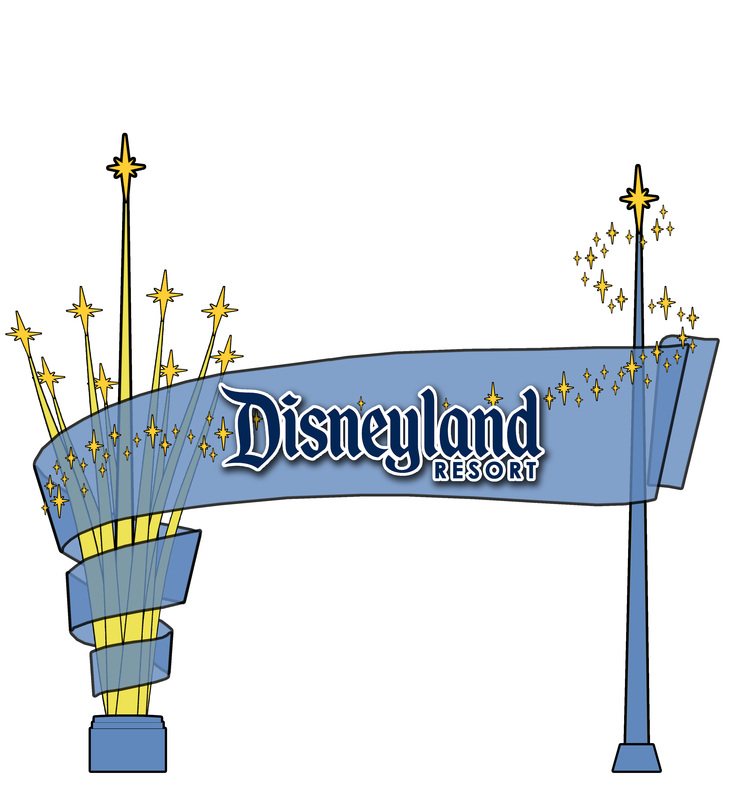
Clearly, this is based on my favorite version of the sign that, as a kid, I was always so excited to drive by, even it we were not going to Disneyland. This version is smaller than the original, more pedestrian size. Walt Disney's name is added as nod to the original roadside billboards. The Eisner Circus sign inspired the video screen. The current Resort sign lists both parks in some locations, so that is included here, but what the current signs add most to my version is adaptability: Different promos would change the "Tag Line" box and could alter the flags to other colors/shapes, pole caps could be swapped out for stars/diamonds, and even individual "Disneyland" letters could have temporary alternatives, like the D60 that is included here. |
